Thursday, December 16, 2010

gallery trip 2


Sonic Shadows by Bill Fontana

SF MOMA


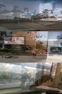
This piece was my first experience with a sound installation in as an art piece. I felt this piece was perfectly embodied the idea of experimental sound. The picture on the far right shows the piece with viewers on it. What the viewer experiences while he or she walks across the bridge on the 5th floor of the MOMA is inanimate objects coming to life via sound. Essentially what is taking place is a live feed of a recreation of the the surrounding area through the medium of sound. Audio beams are shot around the hollowed room via ultra sonic speakers and are played through the speakers set up across the bridge. The sound is haunting, as though the walls are whispering to the viewers.

gallery trip 1


Knowledge Hacking

At UC Berkeley


This was quite the interesting topic to wrap my mind around. The idea of converting the kinetic energy that we produce every day, that normally is just given off as heat, into a harnessable charge was ingenious. The idea itself seems simple however the execution is obviously a tremendous amount of work. I loved how each art piece was strikingly deferent than the next all the while staying on point with the theme. I would say that my favorite piece from the show was the piece that was curtained off and viewers had to step inside. Once inside the viewer had to interact with the piece. The idea was that the viewer places there hands on a device that had various levers that each finger can push. Lights would then light up in accordance to the fingers moved. I really like the idea behind this piece, however I was sad that when I went the piece was not functioning correctly. Overall I would say that this show changed my perspective on art and opened my eyes a little more to what concept art is. Before this show, I was to used to the idea that art was static and untouchable. I found it fun and refreshing that this show called for the audience to be involved.


Wednesday, December 8, 2010

Geospacial art....with the band OkGo!!!

http://www.youtube.com/watch?v=PTke5h_ENlo&NR=1

Ok world!!!! The band Ok Go has announced a geospacial movement! Get up and dance with your city! Check out this video! This event should have already passed in LA but it doesn't have to stop! The world is our canvas and GPS tracks the strokes!!!

Tuesday, December 7, 2010

The Curiosity Monument; A Proposal of Impossiblity


The Curiosity Monument will commemorate the curiosity and innocence lost at young adulthood. This seven foot bunny on wheels will invoke the inner child in every one of us. Warming hearts and bringing the a sense of community where ever he will wonder, Curiosity Monument will get viewers involved with the piece as well as their fellow passerbies!

Curiosity Monument came about when Nova and I where having a discussion on the absurdity of a movable monument. The absurdity is what spurred the idea of the greatness of a large movable monument that could be tracked around the city. Paired with the notion that curiosity takes people to unexpected places, the traceable monument became the method by which I would call audiences to not only explore their inner childhood curiosity but also to act as a community. A rabbit would be the central character for this piece due to the curiosity and innocence that rabbits are normally associated with. The push-able, pull-able rabbit would make its way around the park, it's destination fully up to the passerbies whom will push or pull the monument for any length of time for any distance. It is by chance that a passerby will come upon the rabbit and it is this chance that will invoke curiosity. Once a passerby leaves the rabbit, he or she will wonder where the rabbit will be the next time he or she is in the park. The rabbit will be tracked with a GPS device that will be secured inside the base. This device will allow anyone to check the position of the rabbit online or via smart phone.

Here is a link to a GPS that may be used:
http://www.brickhousesecurity.com/livewire-lightninggps-trackingdevice.html


Here is a conceptual sketch:


As stated, this monument is meant to invoke and commemorate curiosity. The white rabbit, the symbol of curiosity, not only is reminiscent of Alice's white rabbit in "Alice in Wonderland" but also of the white rabbits used in children's magic shows. In both cases, the rabbit is meant to create a sense of awe. This is the main purpose of the piece. It's symbolism is meant to capture the audience and transport them to their childhood where the world was big and new.

This seven foot monument will live within Golden Gate Park. It is here that the rabbit will be in its "natural" space. It is here, in the place meant for children and leisure, that the rabbit can be fully appreciated. Children will be drawn to the piece due to its cartoon nature. Adults will be drawn to it due to the monument's size and maneuverability. It is this maneuverability that makes the rabbit's location unpredictable. One day he could be outside the Japanese Tea garden, the next he could be by the dutch windmill. This is possible due to the large piano dolly mounted to the bottom of the rabbits base. This allows movement in any direction. Audiences of children and adults can choose to move this monument by either pushing the rabbit at its behind or by pulling the rope tethered to the base. The greatest, most efficient, way to move the rabbit is to grab another audience member and have one person push while the other pulls, thus creating a sense of teamwork, community and goal accomplishment once the rabbit arrives at the destination desired. Since the rabbit may never be in the same spot twice, finding the monument may become a challenge. However, with the handy GPS device attached to the inside of the base, the rabbit's movement can be tracked via online or by smart phone!

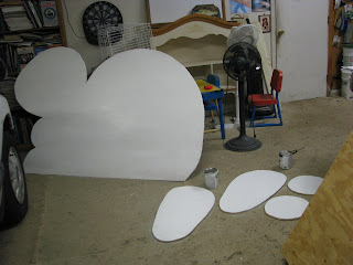
Due to the materials used, the Curiosity Monument is not expensive in the way that most monuments are (although they are awful hard on a student's wallet!!!). The rabbit, in it's entirety, is built from three 8'x4' sheets of plywood, two 2"x4"x8's, two 2"x6"x8's and one large piano dolly. White and black flat matte paints are used to color the piece. Two handles are installed on either side of the base to help with transportation. A long, doubled one inch diameter rope (about 15 feet or so) is used was a pull for the piece. To finish, the rabbit is covered in a flat, water-based, polyurethane varnish and the base is covered in a high gloss, oil-based, polyurethane varnish. The varnishes are meant as a water proof seal. However the oil-based varnish adds an added texture to the base which helps create the look and feel of polished granite. Total costs (including GPS device and subscription) are about $556 plus an extra $40 a month for the GPS tracking. (My out of pocket cost set me back a trip or two to class, costing me about $156 but it was worth it for the feedback of people in the park!)

To build, draw out the rabbit on one of the sheets of plywood. Rabbit should be 4' high and 5' wide. Cut out piece with a jig saw. Next, measure and cut each 2"X6"X8" to 5.5' in length. These two peices will be the sides (length wise) of the base. Nail the newly made 2"x6"x 2.5' (the leftovers from the planks just cut) to the nail them to for the ouside of a rectangular box. Measure and cut the remaining sheets of plywood so that they can be nailed to the rectangular frame. Tadah!!! A box base. Cut the 2"x4"x8" to be 5 foot long. These will create a support for the rabbit to be slid into and then out of for assembling and dissembling purposes. Next paint the base box to look as though it has a granite texture. Paint the rabbit white with a thick, black, cartoony outline. After paint dries, cover the rabbit in the water-based varnish and the base in the high gloss oil-based varnish. Let dry. Attach handles to either side of the base for pulling action. Flip base top down so that the piano dolly can be attached to the underside of the piece. Once attached, flip the base right side up and slip rabbit into the support. Lastly, call up a good friend and beg him for use of his truck so you can get the base to the park!

So the question remains: Being that this piece was actually constructed in reality, how is it in anyway an improbable monument? I believe that this piece counts as an improbable monument on three accounts. 1.) The concept of curiosity and innocence is such a vague and vast concept that no one would commision this piece in the first place. 2.) The notion of movement makes the piece improbable. The weight, even though made from light weight wood, was to great for just one person to move the piece. The piece was also hard to control. If the piece was on a slope, it had a tendency to slid sideways down the slope instead of staying on a straight course. These problems would make the movement aspect of the piece undesirable. No curiosity would spur. No community building would take place. No teamwork would happen. The aspect that makes the piece unique is also the piece's downfall. And 3.) being that the piece is made of wood, the piece is easy to dissemble and destroy thus making it a target for vandalism or material for a homeless persons shelter. The piece would be so easy to steal that no one would be able to leave the piece out of their sight. It would be a costly investment that would be easily destroyed.

To conclude, here are some pictures of the of The Curiosity Monument (aka Cody the Carrot Crusher) in action!

The Process: From Wood to Rabbit

Here are some shots of the work-in-progress


Monday, December 6, 2010

A Work in Progress: A Week in he Life of a Bunny Herder

For the final project I wanted to stay true to my style of art. I believe that innocence and curiosity are a big part of childhood and that these characteristics are lost at the age of young adulthood when reality kicks in. I try to create my art so that adults can, once again, experience the world around then with a child-like wonder. Thus my art is saturated with adorable cartoon critters that explore as a two year old child- with all the goodness and pureness of a heart and head untainted by the coldness of reality.
I played around with big concepts. How does someone capture curiosity? How does one pursued adults to act as children? How can you get this experience from a static object such as a monument? I knew that I wanted to make a monument to childhood curiosity and I wanted the project to ask the viewers to interact with it. But how? In class, Nova and I were talking about our ideas for the project. One of us made the comment that a moving monument would be an awesome idea but it would be so problematic in the real world with it getting lost or stolen. And that's when I was hit with the inspiration for a moving monument to curiosity! How better to capture curiosity's ability to bring people to new and unexpected places then to have a monument that did just that? Explore new places. In theory, a GPS would be attached to the piece and the piece could be tracked on some sort of stationary setup or online.
From this idea I worked out various designs and ideas. I knew that I wanted to physically make a statue because I wanted to be able to work with my hands as well as actually drop the monument into public for instant audience reaction. I thought about which cartoon character that I use that would be the most inviting for the general public. I decided upon the bunny character I draw. This character is innocent, adorable and all around heart warming. After picking the character, I had to decided on the size. I knew that I wanted the rabbit to be big. Bigger than a child for sure but also big enough for an adult to feel as though she or her were a child again surround by a world bigger than her or his own self. I knew that weight would also be a factor so I had to compromise the size to a foot or two smaller than I would have liked. Next mobility. How do I get this rabbit to move? With wheels, but how? Do i make them? Can I find them already made? Do I have to make my own axles? I drew out a couple of designs for the wheel, trying to figure in balance and weight of the rabbit. While designing the mobility aspect of the monument, I also realized that I would have a problem transporting the monument to whatever location I chose. I drew out some designs that included hinges and various slits and slots so that the monument could be assembled and dissembled on site. I was hopping to make it compact enough to fit in my 2 door Hyndai Accent but that was to great a task so I settled with a design that would be able to be transported via my friend,s truck. Lastly, I thought about the location. Where would a giant bunny make the most sense? or at least be the most interesting? At first I pictured him in union square with a mass of people around him. However, I realized that moving the rabbit from the parking structure up onto street level would be to great a task. I then thought about Golden Gate park. I decided that I liked the idea of setting the giant wooden rabbit free in its "natural" habitat.
With my designs in hand I showed my dad the project. Being a carpenter himself he was able to help me finalize the design and set up a list of materials needed. The next day I went out to the store and with the help of my friend, bought and transport plywood, 2x4s and cans of paint to my house. From their I drew out and measured the materials. My dad volunteered to do the cutting of the wood (power saws are not my friends) and help create the box base. I painted the whole set and varnished the piece to make it water resistant (since its been raining off and one for the past couple of days).
After working a couple days, my friend and I loaded up the rabbit pieces and drove from Antioch to Golden Gate park. We found a good place to park and assemble the rabbit. Standing about 7 ft tall, Curiosity monument (aka Cody the Carrot Crusher) made his debut in the park. He was a hit with children and adults alike!

Here are some of the design sketches as well as the final!

Tuesday, November 30, 2010

Signs: What Are They?

Signs are physical abbreviations for larger concepts. They are pictorial markers for events, people, places and ideas. They carry both a literal, or denotative, meaning and a social or human prescribed connotative meaning.

"Part Artistic Terrorists, Part Vernacular Critics;" A Response To Mark Dery's 'Culture Jamming'

In this reading, Dery shouts out a warning to the masses about overbearing evil of the media and their ability to mold the perceptions of the nation. He points out instances in which the media has overtly created news in order to captivate audiences around the country. Bottom line? Money of course. The hazing of the masses for the highest possible revenue for the corporate empire that has slowly grabbed a hold of everyone one of us and has made a home in living rooms around the nation. How are we to combat that which deceives and intellectually feeds us from birth? The watchful eyes of artists and intellectuals catch these rouses and make public the lies and subliminal messaging through guerrilla tactics. As Lorin Mcalpin is quoted, "We are trying to fight for attention as hard as Coca Cola fights for attention." We the artists must fight back for the honor of free speech and free (and unedited) information! Mcalpin insists and reassures that this fight is possible. She says that "[I]f anyone is angry enough and has a Xerox machine and has five or six friends how feel the same way, you'd be surprised at how far you can go."

I feel the most informative section of this reading is the section titled "Culture Jamming" in which Dery describes the various forms that this fight takes. Not only does he give a thourough description of the methods of each art form, but he also gives examples of artists and past work. Paper and wheat paste are the weapons of the children mad at their media parents.

extended body artist (late)


I came across this the other day and got really excited. The portable projection computer is here! Pranav Mistry of MIT has created a wearable interface that allows wearers to access the internet as well as apps or runnable programs via the use of natural hand motion. Though the project is still in it's early stages, the prototype is essentially a combination of a camera, a portable projector and a mirror that is hung around the neck of the user. The user projects images onto any surface (if no surface is present, a hand will do). The hand motion is captured via the camera which picks up on the color caps that are secured to the tops of the fingers, although it is pointed out that nail polish may work just as well to differentiate fingers. In order for the whole set up to work, however, a cell phone is necessary. The cell phone acts as the processor for the system. Here are some links for the TED website:

An interview with Mistry: http://blog.ted.com/2009/03/11/sixth_sense_pranav/

The projects release at TED: http://www.youtube.com/watch?v=mUdDhWfpqxg&feature=player_embedded#!

Tuesday, November 16, 2010

Fun With a Dead Bunny


I had a leftover bunny from the project (he lives in my car for sentimental value) so i let him lose around SF State
:"3

Intervention Time!


This, I believe, is my favorite project so far. For my intervention I decided to go with a real world meets cartoon clash. For my monument I chose the mechanics monument on Market st in the financial district. I felt this was the perfect statue do to its overly masculine style. What I decided to add to the statue was bristol paper cut outs of dead, smashed and bloodied bunnies along with blood splatters.
The main point that I was trying to get across, although fairly abstractly, was the conquering and slaughter of nature through MANkind's endeavors to advance technology. I chose bunnies in particular because they are one of natures gentle creature that have only prey. They are not predators. Bunnies, in this instance, symbolize innocent as well as nature. Not only has mankind ravaged nature but has also slowly killed human/ mammal innocence in pursuit of becoming "superior".


Here is a site that describes the history of the Donahue brothers:
http://www.baycrossings.com/archives/2000/05_May_June/bay_characters.htm

Here is a brief description of the Donahue memorial fountain aka the mechanics monument:
http://www.waymarking.com/waymarks/WM4PPG_Mechanic_Monument_San_Francisco_CA


This project has spawned numerous other ideas such as creating a parking fee sign that should be placed at a specific on ramp in my hometown that is constantly packed with rush hour traffic that normally leads commuters to sitting on the on ramp for minutes at a time without moving.

There is also a third project Id like to do that involve an overpass in Pittsburg that is great for putting up posters due to the heavy rush hour traffic that creeps beneath it. This project would involve putting up a large poster that reads: SUPPORT CHILDRENS ART. This poster would be paired with cartoon characters that has a children's story style to them.

I really enjoy mixing cartoon with reality. Its like real life photoshop!

Tuesday, November 2, 2010

Change a Logo


For this part of the culture jamming project I took the San Diego Comicon logo and changed it to reflect how the convention has evolved over the past few years. What I changed in the logo was the "comic" text and changed it to say "corporate." I also added a dollar sign in the eye of the logo. I made these small changes to show how the convention has began to cater toward mass media and big media corporation. The convention has become less about comics and art and more about commercial media and profit.

logo project


For this project I wanted to focus humanitarian sort of effort. Instead of creating a logo or sign that would cause viewers to question others, I wanted to create a design which would have them reflect upon themselves. I wanted to pair text and picture in a cohesive way which was not intimidating to to viewer. As a result I came up with this adorable logo with two birds which reads 'conscience conscious.' The text is a spin off of the phrase "krishna conscious." I wanted the logo to be able to awaken the viewers from their hazy ego centric state by first grabbing them with color and then secondly by confusing them with the text. I felt the alliteration made the slogan catchy and the use of approximate homonym would cause the viewer to pause and try to recall which word means which. 'Conscience conscious' asks people to become aware of how they treat people as well as how their actions affect the greater whole. The message can be seen as altruistic and a precursor for the idea of 'cosmic conscious.'

Here I made the logo into a sticker pasted it in a campaign slogan which if read with the logo would read "It's all about the conscience conscious." I originally wanted to post it in parks as a way to promote courtesy and respect between children and also be seen by parents. However, I was to short to post the sticker on the park signs. I settled for a campaign sign for the school district instead. The only thing I would do different is make the logo bigger so that it can be readable from the road adjacent to the sign. Certain printers were running out of ink even though the cartridges were just changed, so I had to settle with a small print!!!

Thursday, October 28, 2010

Profiling....An Alternate Ego

For this project I decided to create a completely new identity instead of internet stalking an actual human. I created Abby McMillan. Essentially she is the embodiment of the stereotypical emo/goth highschooler. All the information listed on her profile was found online while I was researching what it meant to truly be considered "goth" or "emo." I tried to make the point that Abby is a tormented soul that lashes out at others and acts as a self absorbed 'bitch' as a way to gain attention and approval. Her hobbies include bad poetry, photography, photoshop and dark music. Here is the link to the facebook page:

http://www.facebook.com/home.php?#!/profile.php?id=100001648835744

All artwork and poetry was formulated by my mind :P

Google Earth Update

My Idea

For my google earth project I wanted to recreate my trek across the US starting in California, goin out as far as South Dakota and then coming back to California. I wanted the viewer to experience the places I went to from the angles I viewed them at as well as angles I felt would be interesting. I also wanted to experiment with lighting and time of day. For instance, when i viewed mt. Rushmore it was late at night and the faces were lit for night viewings so I wanted to convey a similar sense of lighting to the viewer.

My Project

http://userwww.sfsu.edu/~kalmbach/Amber%27s%20South%20Dakota%20Trip.kmz

My Research

This first link I found was for the google earth blog. This blog is dedicated to the work made in the program. This particular post showcases different 3d models that were construct by way of the program. None of these structures exist in physical space, despite how convincing the work is.

http://www.gearthblog.com/blog/archives/2010/06/3d_public_art_in_google_earth.html

This second link I found is of a site that showcases images of crop circles, words and other miscellaneous things carved into farmland. I

http://www.gearthhacks.com/dlcat39/Crop-Circles,-Crop-Art,-Mazes.htm

Thursday, October 14, 2010

Chance project prt 2 (parntners project)


Here is Christina's chance project

1. carry your camera with you on Monday and Tuesday (i'm assuming you'd probably be in the same spot on Mon & Wed, so I changed the days)
2. take a photo of the scene in front of you at 2PM, 4PM, and 6PM
3. In photoshop, create a canvas that is 6 inches tall and 4 wide.
4. Divide canvas into 3 sections
5. On the top section, place all the 2PMs, the middle section 4PMs, and so on.
6.Lower the opacity of the top images to 50%

Tuesday, October 12, 2010

Humans and Technology

This is my "extended body" photoshop project:

before:


And after:


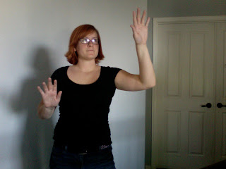
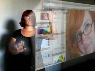
My idea came to me while my boyfriend and I were watching Star Trek. The cyborg character Seven-of-Nine is the character I drew inspiration from. I noticed that she had wire twisting around one of her hands and I thought to myself 'wouldn't it be cool if those wires were connected to sensors at the tips of the fingers that could allow a person to navigate an interface like the internet.' I thought it would be most interesting if you could use this technology to create a more 'hands on' version of photoshop were you could literally click, drag, color, cut!

Monday, October 11, 2010

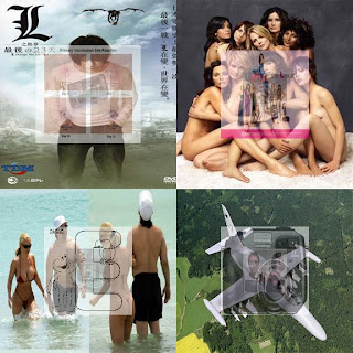
Chance Project prt 1


This is my chance project!

Step 1: Open up an old email from your inbox.
Step 2: Write down every 10th letter (or number) in the email. Repeating letters are ok. (Have no
more than 20 letter total!)
Step 3: Open up an image search engine (such as google image search, yahoo image search,
photobucket image search...etc)
Step 4: Type each letter in individually and save the first image that pops up. If you have a letter
that occurs more than once use the second, third, fourth etc, images that pop up. Have no
repeating images!!!
Step 5: In photoshop create an 8" by 8" blank composition (72 ppi).
Step 6: Divide the composition into 4 equal quardants (4" by 4").
Step 7: Resize the first four images to a 4" by 4" size (72 ppi).
Step 8: Place the first image in the upper left quadrent. Place the second in the upper right
quadrant. Place the third in the lower right quadrant. Place the fourth in the lower left
corner.
Step 9: Resize the 5th, 6th, 7th and 8th images to 2" by 2" (72 ppi).
Step 10: Lower the opacity of these four images to 50%.
Step11: Place the 5th image in the middle of the upper left quadrant. Place the 6th image in the
middle of the upper right quadrant. Place the 7th image in the middle of the lower right
quadrant. Place the 8th image in the middle lower left quadrant.
Step 12: Resize the 9th through 12th images to 1" by 1" (72 ppi).
Step 13: Lower the opacity of these images to 25%.
Step 14: Place the 9th image in the middle of the upper left quadrant. Place the 10th image in
the middle of the upper right quadrant. Place the 11th image in the middle of the lower
right quadrant. Place the 12th image in the middle lower left quadrant.
Step 15: Resize the 13th through 16th images to .5" by .5" (72 ppi).
Step 16: Lower the opacity of these images to 13%.
Step 17: Place the 13th image in the middle of the upper left quadrant. Place the 14th image in
the middle of the upper right quadrant. Place the 15th image in the middle of the lower
right quadrant. Place the 16th image in the middle lower left quadrant.
Step 18: Resize the 17th through 20th images to .25" by .25" (72 ppi)
Step 19: Lower the opacity of these images to 6%.
Step 20: Place the 17th image in the middle of the upper left quadrant. Place the 18th image in
the middle of the upper right quadrant. Place the 19th image in the middle of the lower
right quadrant. Place the 20th image in the middle lower left quadrant.

Thursday, October 7, 2010

"Head to the heart of the city, if the city doesn't have a heart, give it one"

Man and Machine.....Extending the human body

Mark Shepard
"Sentient City Survival Kit"

sentient city project: http://survival.sentientcity.net/

Mark's website: http://www.andinc.org/v3/bio

Mark explores man's relation to the digital world. Many of his projects include the sensing, tracking and networking of humans in urban space. The project "sentient city" explores the idea of near future composed objects that digitally track and monitor the everyday consumer. Such objects include (but are not limited to:

the serendipitor: helps the carrier find something by looking for something else....for example
you put in the name of a location and on the way to the location there are extra
instruction that extend past the idea of finding the final location. for example a direction may say "head toward the heart of the city, if the city does not have a
heart, give it one."

the Ad Hoc Dark (roast) Network Travel Mug: this mug lets the carriers create a portible network wear message can be sent to other carrier. A message can be typed on the screen and then sent via a

Sunday, August 29, 2010

It's All About Subjectivity

In every medium, the communication of ideas changes greatly from generation to generation. Whether the mode be by word, sound, drawing or painting, historical baggage and personal experience gives artists and audiences alike a unique outlook on each work they come across. Sol Lewitt described this disjuncture best in his written work about conceptual art. He states that:

"23. The artist may misperceive (understand it differently from the artist) a work of art but still be set off in his own chain of thought by that misconstrual."

and that:

"24. Perception is subjective."

These statements ring true for not just conceptual art but for art in the broadest sense. However the most important part of this idea is that misperception is not viewed in a negative manner. The original intent of the artist may not be picked up by the viewer however the viewer still cames away with an idea. A new idea can be added to the piece due to viewer's understanding of the work as well as the viewers own life experiences. This idea then gives birth to a series of ideas that, though not necessarily intended, still hold a truth all in their own. It is inevitable that viewers will bring their own bias and experience and thus the perception of a piece will differ from viewer to viewer demonstrating that perception depends wholly on the individual. Though the perception is different the idea the viewer formulates is not wrong, it is just unique.

Help!

I can not find the link for the Sol Lewitt quotes for Art 410! Can anyone help me?